


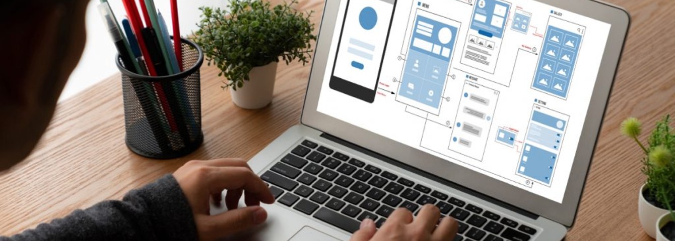
Creating and maintaining websites can be very time-consuming, especially if you are trying to keep up with the constant changes in web design, coding, and programming.
Fortunately, numerous web design tools are available to help speed up this process, so you can spend more time perfecting your design and writing content than trying to meet page requirements through code or other tedious methods.
As more and more people use mobile devices to browse the internet, it is also becoming increasingly important for businesses to have a responsive website.
A responsive website automatically adjusts its layout to fit the device that is being used to view it. This can be done in a number of ways, but using responsive design tools is often the best option.
In this blog post, we will discuss the top fifteen useful responsive web design tools that will help you create stunning websites.
Find Out 15 Useful Responsive Web Design Tools
1. Marvel

Marvel is a responsive web design tool that allows you to create prototypes for your website. It is easy to use and has a user-friendly interface. You can create custom designs or choose from one of the many templates that are available. You can also contact any premier-class custom software development company to get a stunning website developed.
Salient features
- Create custom designs or choose from one of the many available templates.
- Share your prototypes with others for feedback.
Also Read: Custom Software Development Challenges: Alleviate Risk with the Best Practices
2. Figma

Figma is a cloud-based design tool that allows you to create and share vector-based designs. It is similar to other design tools, such as Adobe Photoshop and Sketch, but with the added benefit of being collaborative and cloud-based.
Figma is becoming increasingly popular among designers due to its user-friendly interface and range of features. It enables you to create, share, and test prototypes with ease. You can also hire a dedicated development team to efficiently develop web applications for your business.
Salient features
- Figma lets you design directly in the browser, which means your designs are always up-to-date.
- Work with others on your team to design interfaces and prototypes at the same time.
- Export your designs as PNGs, SVGs, or JSON files that can be used anywhere.
Also Read: 5 Benefits Of Hiring Dedicated Web Development Teams
3. UXPin

UXPin is a comprehensive UX web design tool that allows you to create wireframes, prototypes, and user flows. It also has a built-in collaboration feature that enables you to work with team members on projects.
Salient features
- Wireframe & prototype: UXPin lets you create wireframes and prototypes for websites and apps.
- User flows: Create user flows to visualize the flow of your website or app.
- Collaboration: Work with team members on projects in real-time.
4. Sketch

Sketch is a vector-based design tool focusing strongly on user interface design. It has a wide range of features suitable for designing websites and apps.
Salient features
- Vector-based: Sketch is based on vectors, making it ideal for designing user interfaces.
- Cross-platform: Sketch is available for macOS and Windows.
- Wide range of features: Sketch has many features that make it suitable for designing user interfaces.
5. Adobe XD

Adobe XD is a user experience and interface design tool from Adobe. It lets you create designs for websites and apps and has a strong focus on collaboration.
Salient features
- Design for web & mobile: Adobe XD lets you create designs for websites and mobile apps.
- Strong focus on collaboration: Adobe XD has a strong focus on collaboration, enabling you to work with team members on projects.
- Export anywhere: Export your designs as PNGs, JPGs, SVG files, or HTML prototypes.
6. InVision Studio

InVision Studio is a new user experience design tool from InVision. It has a wide range of features suitable for designing websites and apps.
Salient features
- Design in the browser: InVision Studio lets you design directly in the browser, which means your designs are always up-to-date.
- Prototyping: Create prototypes for websites and apps.
- Animation & motion: Create animated transitions and effects for your prototypes.
- Collaboration: Work with team members on projects in real-time.
7. Wix

Wix is a web development platform that enables you to create websites without writing code. It has a wide range of features and templates that make it easy to create professional-looking websites. You can also hire software developers to create an effective website.
Salient features
- No coding required: Wix lets you create websites without writing code.
- Wide range of features: Wix has many features that make it easy to create professional-looking websites.
- Templates: Wix comes with a large selection of templates that you can use to create your website.
- Mobile-friendly: All Wix websites are mobile-friendly.
Also Read: Top Software Development Tools, Frameworks, and Libraries in 2022
8. Bootstrap

Bootstrap is a front-end framework for developing websites and apps. It provides a wide range of components and utilities that you can use to create responsive designs.
Salient features
- Responsive design: Bootstrap provides a range of features for creating responsive designs.
- Wide range of components: Bootstrap comes with a wide range of components that you can use in your projects.
- Customizable: You can customize Bootstrap to suit your own needs.
9. Sublime Text

Sublime Text is a text editor with a large number of features. It’s not specifically designed for web design, but it has some features that make it useful for the task.
Salient features
- Syntax highlighting: Sublime Text has syntax highlighting for many programming languages.
- Plugin support: Sublime Text has a wide range of plugins that add extra features to the editor.
- Multiple selections: Make multiple selections simultaneously to edit several pieces of text at once quickly.
10. Framer

A Framer is a powerful web design tool for creating interactive prototypes. It allows you to create animations, interactions, and effects that can be used on websites and mobile apps.
Salient features
- Create animations and interactions: Use Framer to create animations and interactions that can be used on websites and mobile apps.
- Code-free prototyping: No coding required.
- Share with others: Share your prototypes with others to get feedback.
- Export your designs: Export your designs as PNGs, JSON files, or Keynote documents.
11. Lunacy

Lunacy is a free vector graphics editor for Windows that allows you to create and edit SVG files. It has a simple and user-friendly interface, making it ideal for beginners.
Salient features
- Create and edit SVG files: Lunacy lets you create and edit SVG files using a simple and user-friendly interface.
- Export your designs: Export your designs as PNGs or JPEGs.
- Works with Windows: Lunacy is a Windows-based editor.
- Free: Lunacy is free to download and use.
12. Webflow

Webflow is a web design tool for creating responsive websites. It allows you to create and edit your designs using a visual interface without writing any code.
Salient features
- Create responsive websites: Webflow lets you create responsive websites without writing any code.
- Edit your designs visually: Edit your designs using a visual interface.
- Share with others: Share your designs with others to get feedback.
- Export your designs: Export your designs as HTML files or CSS files.
13. Pixel Dropr

This is a great tool for creating responsive websites. It features a drag-and-drop interface that makes it easy to create layouts, and you can also use it to create animations and other effects.
Salient features
- Drag-and-drop interface
- Animations and effects
14. Fontello

If you need to create custom fonts for your website, Fontello is a great tool to use. It features a wide selection of fonts, and you can also create your own custom fonts if needed.
Salient features
- Wide selection of fonts
- Create custom fonts
15. Responsive Nav

This is a great web design tool for creating responsive navigation menus. It is easy to use and enables you to create menus that look great on any device.
Salient features
- Responsive navigation menus
- Easy to use
Also Read: Choose The Right Technology For Your Project
Summing Up!
The web design tools listed above will help you create responsive designs for your website. Whether you need to customize a font, design navigation menus that look great on any device, or share your ideas with others, these software products are worth checking out.
They each have their strengths, so choose the one that best suits your needs. Whichever web design tools you choose, be sure to experiment and try out new things to see what works best for you.
Now that we have explored some of the best web design tools for responsive web designing, it is important to understand how different customers interact with websites.
Some customers prefer a simplistic website with easy navigation, while others appreciate more interactive designs that allow for exploration.
However, If you’re feeling overwhelmed by all of this information and would like some professional assistance in creating an online presence that sells, our award-winning web design team at ValueCoders (web development company) is here to help you out.
So, what are you waiting for? Get in touch today!
Frequently Asked Questions
Q1 What are the top 10 reasons for responsive web design?
Below are the top reasons for responsive web design.
- Responsive web design ensures that your website loads faster on all devices. This is important because mobile users are more likely to abandon a website that doesn’t load quickly.
- responsive design also eliminates the need for separate mobile versions of your website, which can often be slow to load.
- Creating a single responsive website is generally more cost-effective than maintaining separate websites for different devices.
- A responsive website gives you the potential to reach a wider audience, as it can be accessed by users on any device, regardless of screen size or resolution.
- Having a responsive website can help you stay ahead of the competition, as more and more businesses are making the switch to responsive design.
- A responsive website is easier to maintain, as you only have to make updates in one place.
- With a responsive website, your visitors will have a better experience, as they can view your website on any device.
- A responsive website is more search engine friendly, as it can be easily crawled and indexed by Google and other search engines.
- A responsive website is more user-friendly, as it provides a consistent experience across all devices.
- A responsive website is the future of web design, so it’s important to get on board now if you want your business to stay ahead of the curve.
Q2 What do you mean by web designing tools?
Web design tools refer to the various software programs and applications that are used to create and construct websites. This can include everything from simple text editors to complex coding languages and everything in between
Q3 What are the three web design elements?
There are three web design elements that are essential to any good web design: unity, balance, and contrast. Unity describes the overall look and feel of the design and how all the elements work together to create a cohesive whole.
Balance offers the design a sense of stability, while contrast provides visual interest and variety.
By incorporating these three elements into your web design, you can create something that is both visually appealing and structurally sound.


