
According to a report by Statista, the total number of mobile app downloads stood at 204.0 billion, and it is predicted to reach over 500.0 billion in the next five years.
Due to the rapidly innovating technology and changing customer needs, software development companies across the globe work to offer innovative, technology-driven, and result-oriented solutions.
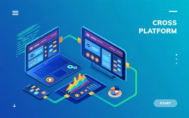
Cross-platform mobile app development is one of the best innovations done in the IT sector. It offers various benefits, such as quicker development time, uniformity, easier implementation, and larger market coverage to the businesses, thus seen as one of the best technologies to go for mobile app development.
Looking at the benefits of cross-platform technology, various businesses have shifted to this technology but choosing the right company to integrate or to build cross-platform mobile app development is the most challenging work.
So, to reduce your research time, today I am going to shortlist the most reliable cross-platform mobile app development company in India-
Following are some of the parameters I followed to shortlist the top-notch cross-platform mobile app development company-
- Years of experience
- Number of projects
- Number of customers
- Number of employees
- Top case studies
- Clutch and Good Firms rating
Let’s start!
9 Award-Winning Cross-Platform Mobile App Development Company
1. PIXELCRAYONS (A TOP-NOTCH CROSS-PLATFORM APP DEVELOPMENT COMPANY)
- Clutch-5.0
- Good Firms- 4.9
PixelCrayons is a recognized cross-platform app development company in India that offers valuable, innovative, robust, and high-performing multi-platform app development services. It provides best-in-class services, including mobile app development, IT Consulting & strategy, and DevOps development.
Deloitte, ISO, and NASSCOM recognize the company as one of the best cross-platform app development companies in India. Furthermore, the company has-
- 20+ years of experience
- Delivered 13800+ projects
- Served 6800+ happy customers
- A team of 500+ developers
Why PixelCrayons?
- 24/7 technical support
- Non-disclosure agreement
- Complete transparency
- Flexible engagement
- Advanced security & scalability
Living organic, Gospel sharing application, gym management web application, and Football statistics app are some of the popular cross-platform app development projects.
2. VALUECODERS ( AN AWARD-WINNING CROSS-PLATFORM APPLICATION)

- Clutch- 5.0
- Good Firms- 5.0
ValueCoders is an award-winning cross-platform application development company in India that offers reliable, robust, innovative, and technology-driven solutions to start-ups, enterprises, and entrepreneurs. In addition, it offers best-in-class services, such as mobile app development, web app development, and custom app development to clients globally.
The company is awarded by Deloitte, ISO, NASSCOM, and Microsoft Partner as one of India’s best multi-platform app development companies. Further, the company has-
- 20+ years of experience
- Delivered 4500+ projects
- Served 4500 happy clients
- A team of 675+ developers
Why ValueCoders?
- Result-driven approach
- Guaranteed innovation
- DevOps development
- Integrity & transparency
- Quality & security adherence
Expense tracking mobile app, a project management system, and a reporting tool web application are some of the trust-worthy cross-platform mobile app development projects.

OPENXCELL
- Clutch- 4.8
- Good Firms- 5.0
OpenXcell is a reputable and multi-award-winning cross-platform application development company located in India. It caters to the needs of startups, enterprises, and entrepreneurs globally, offering them reliable, robust, innovative, and technology-driven solutions such as mobile app development, web app development, and custom app development.
The company has gained accreditation from ISO, CMMI, IGDA, AWS for being one of the top multi-platform app development companies in India. Further, they also has
- 12+ years of experience
- Delivered 1000+ projects
- Served 700+ happy customers
- A team of 500+ developers
Why OpenXcell?
- Transparent cost
- State-of-the-art facilities
- Quick project delivery
- Team ownership
- Premium software development
OpenXcell ensures the best resource selection and development of innovative solutions that are futuristic and user-friendly, offering end-to-end Business & Technology Consultation.
Also Read: Flutter Vs React Native Vs Xamarin – Top Cross Platform Mobile App Development Frameworks
CREATETHRIVE
- Clutch – 5.0 ratings
CreateThrive is an expert mobile product and web development expert, bridging the highest user experience with enterprise-grade scalability and performance. They combine outcome-driven development, creativity, and technical expertise to offer high-quality and scalable solutions.
They are Clutch certified and a Google Cloud partner. They help clients scale their businesses and realize their product goals. Further the company has-
- 4+ years of experience
- 100% customer satisfaction
- A team of 50+ members
Why CreateThrive?
- Think critically
- Take ownership
- Quality-driven
- Service-oriented
- Collaboration
The client always comes first. We build deep relationships with our clients that go beyond technology, helping them achieve great results.
CYNOTECK TECHNOLOGY SOLUTIONS
- Clutch – 5.0 ratings
- Good Firms- 4.5 ratings
Cynoteck is a professional and dynamic cross-platform mobile app development company that offers robust, technology-driven, and result-oriented solutions to its clients. Apart from cross-platform mobile app development services, it offers other services, such as mobile application development, web development, and CRM consultation & implementation to clients across the globe.
The company is recognized by ISO, NASSCOM, BRONZE, & Microsoft Partner as one of the best cross-platform mobile app development companies. Furthermore, the company has-
- 12+ years of experience
- Delivered 100+ projects
- Served 150+ happy customers
- A team of 50+ developers
Why Cynoteck Technology Solutions?
- Cost-effective
- Collaborative
- Early Adopter
- Process-oriented &
- Transparency
N-Fuzed, Xerillion, Universal logger, and Retro are some of the best-in-class cross-platform app development work samples, Cynoteck has delivered so far.
Also Read: List Of Top Flutter App Development Agencies
INDUS NET TECHNOLOGIES
- Clutch- 4.8
- Good Firms- 4.5
Indus Net Technologies is a trust-worthy multi-platform app development company in India that offers top-notch multi-platform app development services to clients around the globe. the globe. It provides web development, digital marketing, mobile development, and quality analytics services to start-ups, enterprises, and entrepreneurs.
The company is awarded by Deloitte, Dun & Bradstreet, CID Choice, NASSCOM, and FITS as the top cross-platform mobile development company. In addition, the company has-
- 20+ years of experience
- Delivered 11000+ projects
- Served 25000+ happy clients
- A team of 750+ developers
Why Indus Net Technologies?
- Full-Service Digital
- Guaranteed Innovation
- Better Flexibility
- Agile Development &
- Technology Leadership
Cashpoint, SOMAX, AERA, SRMB, and Siddha are some of the reliable cross-platform development case studies Indus Net Technologies delivered.
GEEKYANTS
- Clutch- 4.8
- Good Firms- 4.5
Geekyants is a company that transforms ideas into reality! The company is one of the best cross-platform app development companies in India that provides top-notch services to clients across the globe. The company has a track record of delivering intuitive, interactive, and high-performing multi-platform apps.
Clutch and Good Firms recognize the company as one of India’s trust-worthy cross-platform mobile app development companies. Besides, the company has-
- 12+ years of experience
- Delivered 500+ projects
- Served 200+ happy customers
- A team of 50+ developers
Why Geekyants?
- On-demand technical support
- Agile development
- Co-development team
- Better security and quality
- Integrity & transparency
Parcel app for PayPoint, Endlink, Social app, Dating app, and a real-estate app for Torii are some of the best-in-class mobile app development projects the company has worked on.
Also Read:Top 10 Mobile App Development Companies That Innovate Unique Solutions
SOLULAB
- Clutch- 5.0
- Good Firms- 4.9
SoluLab is an authorized cross-platform application development company in India that offers world-class cross-platform mobile application development services to its clients across all the globe. It offers blockchain development, mobile app development, machine learning development, and custom software solutions.
The company is recognized by Clutch, GoodFirms, AppFutura, and Top Firms as one of the reliable cross-platform app development companies. The company has-
- 16+ years of experience
- Delivered 1500+ projects
- Served 500+ clients
- A team of 150+ developers
Why SoluLab?
- Quality & transparency
- Rich & varied experience
- Innovative solution
- Problem-solving approach
DocTrace, Snackhack, Acreage, Chichin, and Union edge are some of the top-notch cross-platform mobile development case studies of SoluLab.
CONSAGOUS TECHNOLOGIES
- Clutch- 5.0
- GoodFirms- 4.5
Consagous Technologies is the best cross-platform app development company in India that provides reliable, technology-driven, & result-oriented solutions. Apart from this, it offers mobile app development, digital marketing, IT consulting, and web development services to start-ups, enterprises, and entrepreneurs.
The company is recognized by GoodFirms, Clutch, Top App Development, and App Futura as one of the multi-platform cross-platform mobile app development companies in India. The company has-
- 12+ years of experience
- Delivered 697+ projects
- Served 344+ clients
- A team of 196+ developers
Why Consagous Technologies?
- No-box approach
- Continuous testing
- Astonishing designing
- Strict guidelines & policies
- Experienced developer team
CheapEatz, OTBOO, BongaPay, and Prodaddy are some of the best-in-class cross-platform mobile app development projects of Consagous technologies.
Also read: 9 Top-Notch Cross-Platform App Development Companies
Final Words-
Thus, these are the 7 top-notch cross-platform mobile application development companies in India that you can hire for your cross-platform app development at an affordable price.
I have been an IT consultant in India for almost 16 years and looking at the above-mentioned list, I would like to suggest you go for ValueCoders, SoluLab, or PixelCrayons as your cross-platform mobile development company.


