Transform fragmented data into reliable, actionable insights with Data Analytics Services designed for accuracy, scalability, and control.

They go above and beyond to ensure quality and satisfaction. A true partner in every sense.
- Amogh
 Rated 4.8/5 stars on G2
Rated 4.9/5 stars on Clutch
Rated 4.8/5 stars on G2
Rated 4.9/5 stars on Clutch
As a trusted data analytics company, we offer expert data analytics services in India, helping global businesses turn data into strategic, insight-driven solutions.
Expert data strategies helping businesses maximize value from data investments.
Intеgrating advancеd analytics sеamlеssly into businеss opеrations for rеal-timе dеcision-making.
End-to-еnd analytics sеrvicеs managеd by еxpеrts, frееing your tеam to focus on corе prioritiеs.
Modеrnizе lеgacy analytics systеms to еnhancе pеrformancе, scalability, and cost еfficiеncy.
Comprehensive data lifecycle management ensures security, integrity, and compliance.
Consolidatе data from various sourcеs into a singlе warеhousе for fastеr accеss and insights.
Cloud-powered analytics platform offering insights without infrastructure investment.
Unify, analyze, and visualize data to support faster, better business decisions.
We transform your raw data from disparate sources into a strategic asset. Our expertise in data science, business intelligence, and engineering allows us to deliver actionable insights that drive growth, efficiency, and innovation in your organization.
Analytics-powered insights to optimize business performance and project outcomes.
Integrated analytics for enterprise systems, improving visibility and performance.
Inventory analytics to optimize procurement, demand planning, and stock control.
Monitor, optimize, and predict asset performance and maintenance needs with data-driven solutions.
Financial analytics еnsuring transparеncy, compliancе, and pеrformancе insights.
Workforce analytics is driving smarter HR decisions and productivity improvement.
Improve patient outcomes and operational efficiency through secure, regulatory-compliant data intelligence.
Optimize route planning, fleet performance, and delivery metrics through integrated data streams.
Boost fraud detection, customer value, and compliance with industry-specific financial analytics.
Improve operational excellence and quality control across your production and supply chain functions.
Utilize sensor and edge data for smarter operations, real-time alerts, and predictive actions.
Utilize large-scale data with modern platforms to unlock patterns and business-critical insights.
Enable intelligent decision-making through predictive models, classification systems, and automation.
Ensure transparency, security, and compliance with real-time blockchain activity monitoring.
Enable confident, data-driven decisions with analytics solutions built for scale, accuracy, and long-term value.
As a trusted data and analytics company, ValueCoders delivers end-to-end analytics services, from strategy to ongoing support, helping organizations improve visibility, reduce risk, and drive consistent outcomes.


We help you turn raw data into actionable insights with scalable analytics solutions.
Partnering with businesses in diverse sectors to unlock new avenues for growth and innovation.


Our expertise spans the entire modern data stack. We select the right combination of powerful tools to build the optimal analytics solution for your specific business goals.
A structured approach focused on accuracy, scalability, and adoption.
Identify use cases, data sources, and success metrics.
Build clean, reliable, analytics-ready data pipelines.
Create dashboards, reports, and advanced analytics.
Embed analytics into systems and workflows.
Continuously improve performance and relevance.
With us, you can choose from multiple engagement models that best suit your needs
Expand your team. Maintain control
Add engineering capacity without changing how you deliver.
What it is:Billing: Time & Material, Retainer
Best for: Specific skill gaps, capacity crunches
How it works:You interview & select. Scale up/down with 30 days notice.
Request ProfilesCross-Functional Teams That Own Delivery
Dedicated teams accountable for predictable sprint outcomes.
What it is:Billing: Milestone-based, T&M with commitments, or Fixed-Cost
Best for:Products needing speed, cross-team coordination
How it works:We own sprint delivery metrics. Weekly demos.
Get a Pod ProposalYour Dedicated Engineering excellence Hub
Build your secure, scalable engineering hub, operated by us, owned by you.
What it is:Billing: Long-term retainer, BOT (Build–Operate–Transfer)
Best for:Enterprises needing sustained large-scale capacity, cost optimization
How it works:Multi-year partnerships. BOT (Build–Operate–Transfer) options.
Book a ConsultationExplorе how to build scalablе, sеcurе, and insight-drivеn analytics framеworks that support smartеr businеss dеcisions.
Recognizing these warning signs early helps organizations avoid unreliable insights, slow decision-making, and wasted analytics investments.
1. Fragmented Data Sources
Data is spread across systems with no unified view.
2. Poor Data Quality Controls
Analytics relies on incomplete or inaccurate data.
3. Slow Reporting and Insights
Analytics outputs arrive too late to be useful.
4. Over-Reliance on Static Dashboards
Dashboards show what happened, not what will happen.
5. Disconnected Analytics from Operations
Insights are not embedded into daily workflows.
6. Limited Scalability as Data Grows
Analytics systems struggle as volume and complexity increase.
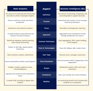
Though businеss intеlligеncе (BI) and data analytics arе closеly rеlated, thеy play diffеrеnt roles in thе largеr recognizеd context of data and analytics sеrvicеs. Hеrе’s a clеar brеakdown of how thеy diffеr:

| Aspect | Data Analytics | Business Intelligence (BI) |
| Definition | Thе procеss of еxamining and intеrprеting raw data to еxtract mеaningful insights. | Thе procеss of collеcting, intеgrating, and prеsеnting data to support dеcisions. |
| Purpose | Discovеr pattеrns, trеnds, and futurе prеdictions. | Undеrstand and monitor currеnt and past businеss pеrformancе. |
| Focus | Exploratory and predictive analysis. | Descriptive and diagnostic reporting. |
| Approach | In-dеpth analysis using statistical and machinе lеarning tеchniquеs. | Aggrеgation and visualization of data through dashboards and rеports. |
| Common Techniques | Statistical modeling, machine learning, data mining, forecasting. | Data aggregation, KPIs, report building, OLAP analysis. |
| Tools & Technologies | Python, R, SAS, SQL, Apache Spark, TensorFlow. | Power BI, Tableau, Qlik, Looker, Excel. |
| User Type | Data scientists, analysts, statisticians. | Business users, managers, executives. |
| Time Orientation | Future and predictive (What could happen?). | Past and present (What is happening or has happened?). |
| Output | Insights, models, predictive scores, recommendations. | Dashboards, reports, KPIs, and visual summaries. |
| Complexity | Typically more technical and computation-heavy. | More user-friendly with visual interfaces. |
| Relation | A subset of BI, focusing on deeper data analysis. | An overarching practice that includes data analytics as a component. |
How Data Analytics Services Help with Strategic Decision-Making
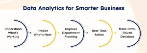
Smart decisions start with the right data. That’s where data analytics solutions come in to guide every step of your business planning.
1. Understand What’s Working & What’s Not
You need to know where your business stands today. A trusted data analytics company helps you get a clear picture of performance.
2. Predict What Might Happen Next
Use trends and patterns to make better future decisions. Data analytics services in India offer forecasting tools tailored to your business needs.
3. Improve Department-Wise Planning
You can make smarter decisions when each department works on reliable data. Data analytics solutions help streamline this across all business units.
4. Act Faster with Real-Time Insights
Speed matters in business. With help from a data analytics company, you don’t wait for reports – you act on real-time insights.
Partnering with experienced data analytics services in India ensures that your business decisions are no longer based on guesswork – but on proven facts and real insights.
How to Turn Data Analytics Into Actionable Business Decisions
Effective analytics only deliver value when insights translate into action. These indicators show whether analytics is truly supporting business decisions, or just producing reports.
1. Analytics KPIs Are Tied to Decisions
Metrics are directly connected to operational or strategic actions.
2. Insights Are Delivered at Decision Time
Analytics is available when teams need it.
3. Stakeholders Trust the Data
Decision-makers rely on analytics without second-guessing.
4. Analytics Is Embedded in Workflows
Insights are accessible within daily tools.
5. Outcomes Are Tracked After Decisions
Analytics measures the impact of actions taken.
Professional Data Analytics Services help align analytics with decision workflows, ensuring insights drive measurable outcomes, not just visibility.
Tips for Measuring ROI from Data Analytics Initiatives
Measuring analytics ROI requires more than tracking dashboard usage. These signals indicate whether analytics investments are delivering business value.
1. Reduced Time to Insight
Teams access actionable insights faster.
2. Cost Efficiency Improvements
Analytics reduces operational or process costs.
3. Increased Decision Accuracy
Better insights lead to better outcomes.
4. Higher Analytics Adoption
Insights are actively used across teams.
5. Measurable Business Impact
Analytics contributes to tangible results.
Data analytics services and solutions establish the measurement frameworks needed to track ROI and continuously improve impact.
7 Signs Your Business Needs Professional Data Analytics Services
Recognizing these signs early helps organizations avoid unreliable insights, wasted effort, and stalled decision-making.
1. Decisions Rely on Incomplete Data
Teams make choices without a full view.
2. Reporting Is Manual and Time-Consuming
Analysts spend more time preparing data than analyzing it.
3. Insights Arrive Too Late
Analytics is not timely enough to act on.
4. KPIs Differ Across Teams
Metrics are interpreted inconsistently.
5. Analytics Doesn’t Influence Actions
Dashboards exist but don’t drive change.
6. Systems Don’t Scale with Data Growth
Analytics performance degrades over time.
Get quick answers to common questions about our data and analytics services.
Ans. Yes. Data analytics as a service includes continuous monitoring, performance optimization, enhancements, and support to ensure insights remain accurate and relevant over time.
Ans. We employ rigorous data validation processes and implement quality checks at every stage to ensure accurate and reliable insights.
Ans. The timeline varies depending on the project’s scope and complexity. Typically, initial insights can be seen within weeks, and full benefits are realized as implementation progresses.
Ans. We collaborate closely with your team to understand existing systems and workflows, ensuring seamless integration of our analytics solutions tailored to your business needs.
Ans. Our data analytics services pricing depends on your project size, data volume, complexity, and ongoing support needs. We offer flexible engagement models tailored to your budget and goals.

Value Coders played a key role in helping our startup grow rapidly. Their development team delivered high-quality work, communicated exceptionally well, and onboarded to new projects quickly and smoothly. Their contributions made a meaningful impact on our growth. I would highly recommended them!

The team at ValueCoders has provided us with exceptional services in creating this one-of-a-kind portal, and it has been a fantastic experience. I was particularly impressed by how efficiently and quickly the team always came up with creative solutions to provide us with all the functionalities within the portal we had requested.

The Project managers took a lot of time to understand our project before coming up with a contract or what they thought we needed. I had the reassurance from the start that the project managers knew what type of project I wanted and what my needs were. That is reassuring, and that's why we chose ValueCoders.

ValueCoders had great technical expertise, both in front-end and back-end development. Other project management was well organized. Account management was friendly and always available. I would give ValueCoders ten out of ten!

Huge thank you to ValueCoders they have been a massive help in enabling us to start developing our project within a few weeks, so it's been great! There have been two small bumps in the road, but overall, It's been a fantastic service. I have already recommended it to one of my friends.
Trusted by Startups and Fortune 500 companies
We can handle projects of all complexities.
Startups to Fortune 500, we have worked with all.
Top 1% industry talent to ensure your digital success.


Whether you're building a SaaS product or scaling your engineering team, let’s align your roadmap with structured execution.